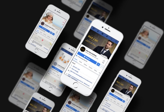
In today’s technological world, clients are more likely to visit your website first before visiting your cosmetic clinic. This is how they judge your reliability, experience and find out more about the services that you offer. Everyone relies on the internet for information and this is no different for clients looking for cosmetic surgery.
So, one of the best investments you can make as a plastic surgeon and cosmetic clinic owner is in your website. This is the face of your brand and it is going to be vital for attracting clients in the door.
Let’s take a look at some of the medical website design trends you can’t ignore this year.

A User-Friendly Design
The last thing that a client wants is to visit your website and not be able to find the information they want. Nobody wants to scroll through lots of menus and complicated pages. This is just confusing and frustrating. You want to make sure that your medical website design is welcoming and user-friendly. You don’t want your visitors to leave your website and turn to other cosmetic clinics and plastic surgeons. Studies say that having a strong user experience is going to increase your conversion rates and this could be by up to 400 percent.
Less Clutter More Simplicity
You may think that clients want to read every last detail about your cosmetic clinic or the procedures that you offer. While you want to educate potential clients, you don’t want to overload them with too much information. If they get bored, they’re going to leave. For your medical website design think about simplifying everything. You want a lot of white space on your webpages, with the idea being that it’s easy to read. Of course, we don’t mean literally white space. We just mean small amounts of information on each page so it’s not like clients are reading a novel. This is going to contribute to a better user experience and hopefully more clients at your cosmetic clinic. Also, don’t add to0 many images to your website either. Think that less is more.
Include Videos
Videos are a fantastic visual to include on your website. You can give clients an idea of what your clinic looks like, as well as introduce the team. It can be very welcoming for customers to find out more about you first.
In addition, videos can help to increase SEO ratings too. When clients stay on your website longer, Google will give you a better rating. This means you’re going to appear higher up on the search pages. A good way to encourage clients to stick around is if the video starts playing automatically on the webpage.
A Mobile-Friendly Website Design
People all over the world are using their mobile device more now than they ever did before. Smartphones are so advanced now that they’re actually preferred for surfing the web than computers. So, what does this mean for your medical website design? Well, it means you’ve got to make sure that it’s mobile-friendly for clients. This is going to make sure they stick around and find out more about your cosmetic clinic.
Optimizing your website is quite simple. It all starts with having a responsive design that is going to automatically adjust the size of the user’s screen. Chances are, you’ll need a designer to make it responsive for you. It should also be capable of scrolling easy. After all, people normally just use their thumb to scroll. Nobody wants the hassle of zooming in and out – nobody has time for that today!
You could also think about getting a mobile app for your clinic. This is going to be specifically designed to work well on mobile devices. It’s usually a lot easier and it can be for your regular clients to use and gain information. They could view and make appointments, read about new technology or even choose the treatments they like. The good thing is that mobile apps can be integrated with your website.

Try Out Illustrations
We all know those generic and free images you can use for your medical website design. In fact, there’s bound to be clinics that use the same ones. They’re easy to access and quick to use on your website. But it doesn’t make you unique and you blend in with other cosmetic clinics.
So, why not make your website stand out from the crowd? One way to do this is with fun illustrations. This is going to be unique and set you apart from the competition. When you have them designed just for you, you’ll know that no one else has one like it. You have the opportunity to get creative and have some fun. Not everything in business has to be serious!
Bring Back Bold and Bright Colours
Think about it; do you really enjoy visiting a website that is bland and boring with black and white colours? The chances are, it won’t be interesting or memorable. Of course, you want your medical website design to be instantly recognisable and get your clients interested in the cosmetic services that you offer. A way to do this is by using bold and bright colours. You’ll be surprised just how much this can help. In fact, it can even make the information easier to read too. They say that clients decide what they think about your cosmetic clinic within 90 seconds of visiting your website. Keep them on your webpages by going bolding.
Interactive Chat Features
The chances are, new clients that are visiting your cosmetic clinic’s website are going to have questions. Of course, people aren’t patient and they usually want the answers straight away. Sure, you have your telephone number and email listed on your website. But why not introduce a live chat feature? This means that clients can ask the questions they have and get the answer quickly. Plus, there are people that don’t want to inquire over the phone. So, this is the perfect solution.
